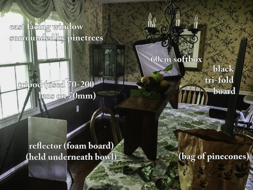
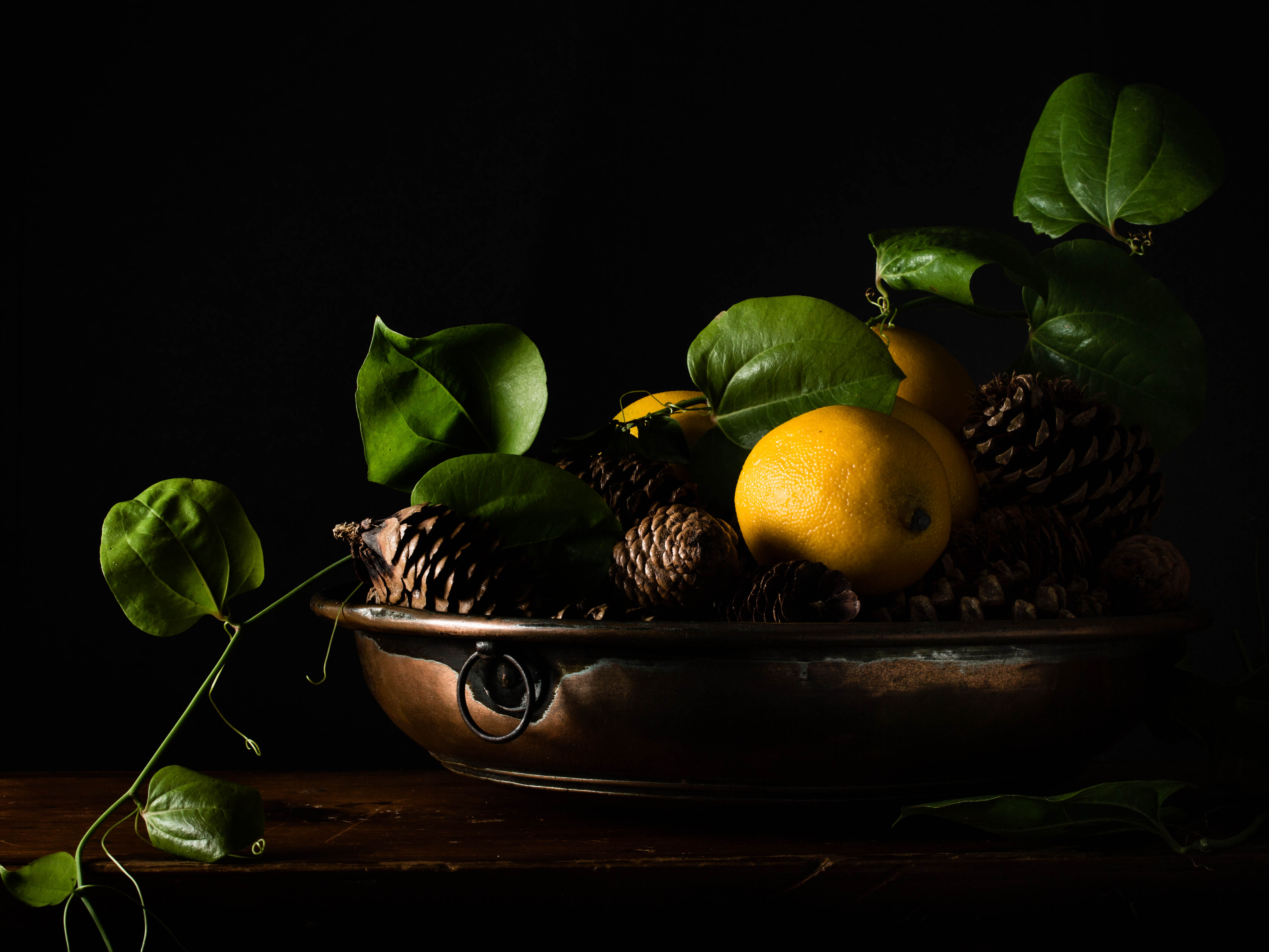
With only an hour to play around until I had to pick up a son from a friend’s pool, I got right to work, setting up the tripod and lightstand. It took me awhile to get the stupid background to stand upright, and then a few more minutes were spent trying to get the vine to lay the way I wanted it to over the bowl.
But once I got the flash in the softbox, it was almost perfect on the first click. Oh, how I love that! (Because most times it takes endless loops of shoot, chimp, adjust aperture or flashpower, shoot, chimp, adjust…)

The behind the scenes shot was taken a few hours later after I got back, so the softbox is not exactly as it was in the actual shot (I couldn’t get a straight story about who was to blame for that) but I hope you get the idea. It was directly to the side of the bowl, right on level with the bowl and the bench.
If you compare this shot to the umbrella-lit sunflowers you can see how much stronger and directional the light is. That’s because there is much less spillover with a softbox. That light has nowhere else to go but out the front panel. I did have a smaller diffuser inside the softbox too, so that helped it to be as soft as the umbrella…that and the fact that I had it pretty close to the bowl. It may seem counterintuitive (a lot of this flash stuff is) but the closer the light the softer (and prettier) it is.
I used Lightroom and NIK software’s Viveza to edit it. Even though the reflector helped open the shadows on the right side a bit, I lost them all when I pushed the contrast and clarity up. That’s where Viveza came in to save the day. I used their control points to select a few areas (the pine cones on the back of the bowl, and the shadow on the lemon) and then only brighten those bits. Have you used Snapseed on your cell? It’s the same software and boy do I love those control points. It makes things so quick and easy. It took me literally ten minutes of editing and most of that was me trying to decide if I could live with the medium contrast or did I really need the strong. (I went with the strong and just pulled the saturation down a bit).
Anyway, I am so happy with how this one turned out. I think this time, I really hit the mark on the inspiration piece.


So lovely. Loved seeing your setup.
Thanks, Diana. I know my dining room photo studio is getting some traction! ; )
Just found you as a newbie to Flickr – this is such an interesting post for me (as still life photographer is very much my thing!) – the resulting photo is gorgeous
Hi Jane! It’s always nice to meet another photographer who shares a passion for still life photography. I recently started a G+ community called Sunday Still Life as a place to share our photos and meet others with similar interests. I’d love for you to check out the community. http://bit.ly/1nRVf4g
Thanks for stopping by my blog! 🙂
A wonderful finished piece love seeing your work around…
Thanks, Viv! I’m always happy to see you around too. : )
Terrific. Reminiscent of Dutch art. I am in awe of your set up..
Thanks, Sally! Nothing like trying to be creative in the cracks of everyday life, don’t you like my dining room photo studio? 🙂
I like seeing how you set up your room! Thank you. That has been hard for me to figure out.
Thanks, Naomi. I think it really helps to see how everyone is solving their problems, I know we all have them and I think a lot of us have very similar ones (like trying to photograph around the everyday stuff!)
Love this photo! I am thinking I may have to buy a flash:) Thanks for all the set up info again…I am learning so much here!
It’s been a slow process for me — lots and lots of trial and error but I think I’m finally starting to get the hang of it. : )