Take Three
Second Call: A Single Rose — Cheryl
Yesterday, Bridget came home with this lovely red rose. Today, I decided to use it for a relatively straightforward series on backgrounds.
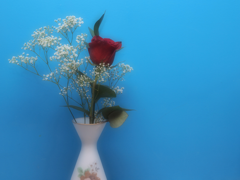
I tend to favor clear, bright colors (the blue background is the wall of my studio), and I like the contrast between the red of the rose and the blue of the wall in photo one. To me, it reads as a happy, vibrant image, and the strong contrast puts the flower front and center — even though it’s actually off the side a bit ; ).
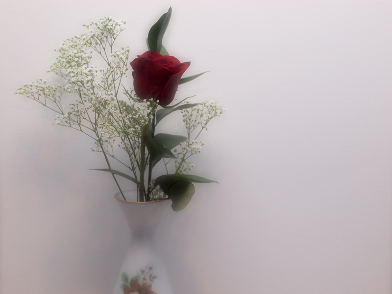
With the vase and baby’s breath almost melting into the background, the rose in front of a white canvas has a romantic feel.
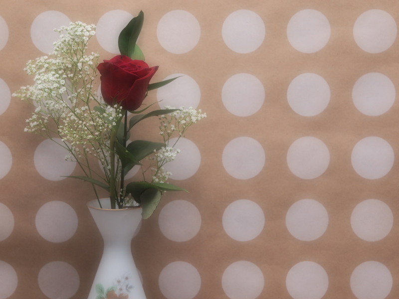
The polka dots in the final image add a sense of fun to the image, but the juxtaposition of the classic (somewhat uptight) red rose and baby’s breath and the irreverent dots doesn’t really work for me. There’s just too much competition for the viewer’s attention.
At first, I thought I liked the image with the white background best, but on second thought, the image with the blue background is my favorite. How about you?


Now this is an interesting experiment. I definitely like the white background best (but then I can be kinda boring that way…) : )
The polka dots are too busy, you are right, and just don’t fit the scene. It might be interesting in black and white though, without the color to compete for attention.
The blue, on the other hand, seems to turn the rose almost purple (which is probably a trick of my monitor — I just got a new one that I’m not loving too much) or seems to just make it that much darker.
Did you use your lensbaby on these? I just took mine to the park yesterday for the first time in a while but didn’t get anything great.
I swear that I will have a response today. I’m scheduling it in!! ; )
I did not use my Lensbaby, but I turned on my in-camera Soft Focus filter.
The purple in the rose might be your monitor. I don’t get that. Interestingly, though, I get a greater emphasis on the wilted sections of the rose with the blue background. Maybe that was just my focusing.