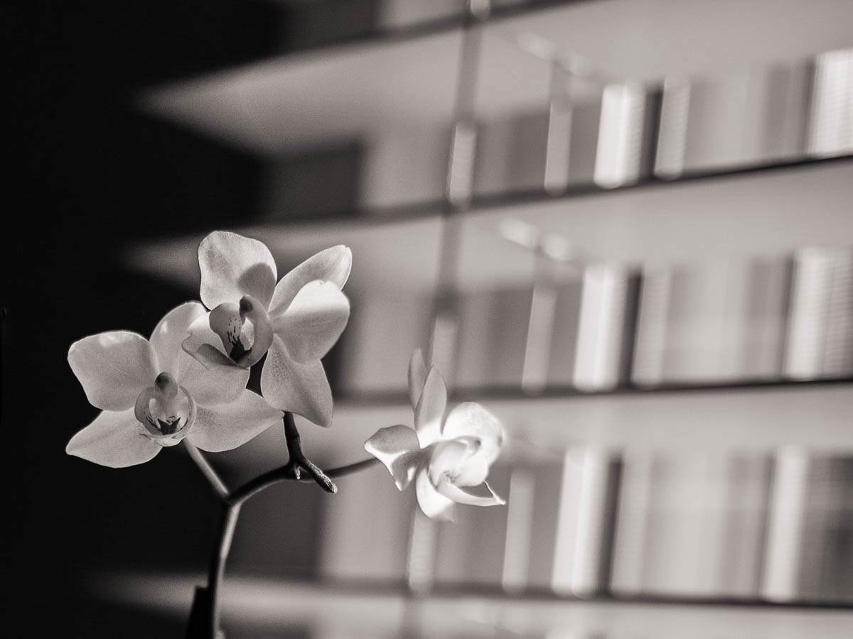
Still life photography can be a challenge. Sometimes you stumble across a scene, and with very little fussing you can create something beautiful. This orchid was just a such a shot — it was sitting so nicely in front of all those leading lines just waiting for it’s close-up. Other times, it seems that no matter how you arrange the subjects it just doesn’t work. It can be so frustrating and tedious!
There are three things that are key to a good photo. Well, guidelines to a good photo anyway and they are light, composition and moment. I’m taking this from lifestyle photographer Kristen Lewis but I believe this idea can be applied across the photographic spectrum.
Light
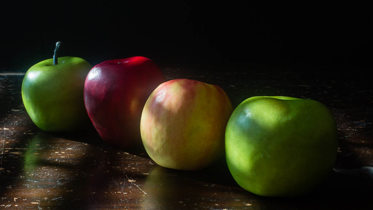
Without light there are no shadows and without shadows there is no contrast. Our eyes are drawn to contrast. An interesting photograph will have meaningful contrast. And I mean more than just a big S curve on the tone graph in Lightroom. As you are composing the photo you should keep in mind natural shadows. It helps to define the dimensionality of the subject as well as set the mood of the piece. Does every piece need deep shadows? No, but there should be some degree of shadow or something else interesting about the light.
Composition

Composition is more than just the rule of thirds. It is the way the photographer sets things up (in a still life shot at any rate) that draws our eyes through the piece. It is how we get the meaning of the piece across to our viewers. Michael Freeman’s book The Photographer’s Eye uses the nine principles of design to teach composition. Hierarchy, space, gestalt, and movement are design concepts that explain how our brain understands and makes sense of visual information. I highly recommend this book. It changed the way I compose.
Gesture
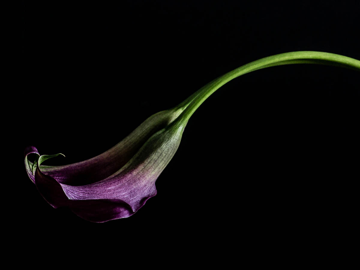
Now, what Kristen called “moment” — an exchange or emotion, I am going to call gesture. It’s hard to have an exchange between two people in a still life after all. Gesture is some part of the composition that becomes a focal point for the eye. It can be the simple curve of the flower stalk that gently leads our eye to the flower or even the yellow-green of a leaf, brightly backlit. There is just something within the composition itself that says something more about it.
Put it all together
Rules are rules and usually meant to be broken in photography but guidelines are like universal truths. The closer you keep to them, the better your photographs. As you set up your still life shot keep in mind the light and shadows, good composition and a gesture or moment within that composition that atracts the eye and gives it a place to start exploring the picture. That will give you a successful still life.


great guidelines 🙂
and that last image…stunning…love thinking about the word ‘gesture’ in relation to that shot.
Thanks, Michelle! It does make you look at still life a different way — which makes it a little more lively, you know?
I completely agree that the last photo of purple against the black is gorgeous!
Great tips here, Jessica.
Thank you for sharing!
I agree, the purple on black is stunning. In fact, this is the best images I’ve seen…I find these difficult to photograph and capture their beauty.